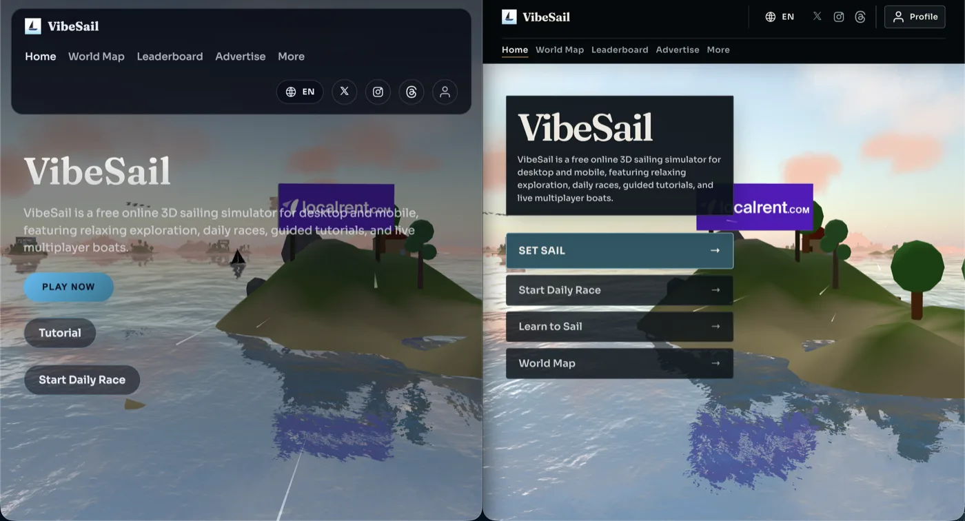
We refreshed the homepage and the rest of the public site so the first moment on VibeSail feels clearer and more inviting.
The sailing world is still the star. What changed is how the title, actions, and navigation sit on top of it.
- The homepage title and short description now sit in a simple dark card, so they stay readable over bright skies and busy docks.
- Set Sail leads a tidy stack of actions for the daily race, learning to sail, and the world map, with less clutter and clearer priorities.
- The header is easier to scan, with Profile called out and High Sea listed as Beta High Sea under More.
- Pages like Feedback, Contact, Profile, and the rest of the site share the same calm look, so moving around VibeSail feels more consistent.
Nothing about how you sail changed. This is just a cleaner front door into the same open water.